McDougal’s Chicken - Rebrand
McDougal’s current and only logo I’ve ever seen them have.
Process:
For a class, we were asked to rebrand something that wasn’t a mega-corporation or internationally known brand, like Coca-Cola, Google, Apple, Nike, etc. We began with research into the businesses and brands that we were most interested in, and mine quickly went to food from my hometown, Nashville. McDougal’s has three locations, lots of competition (cause hot chicken) and yet they are still well known to every one of my high school friends because of the quality that they have maintained for years.
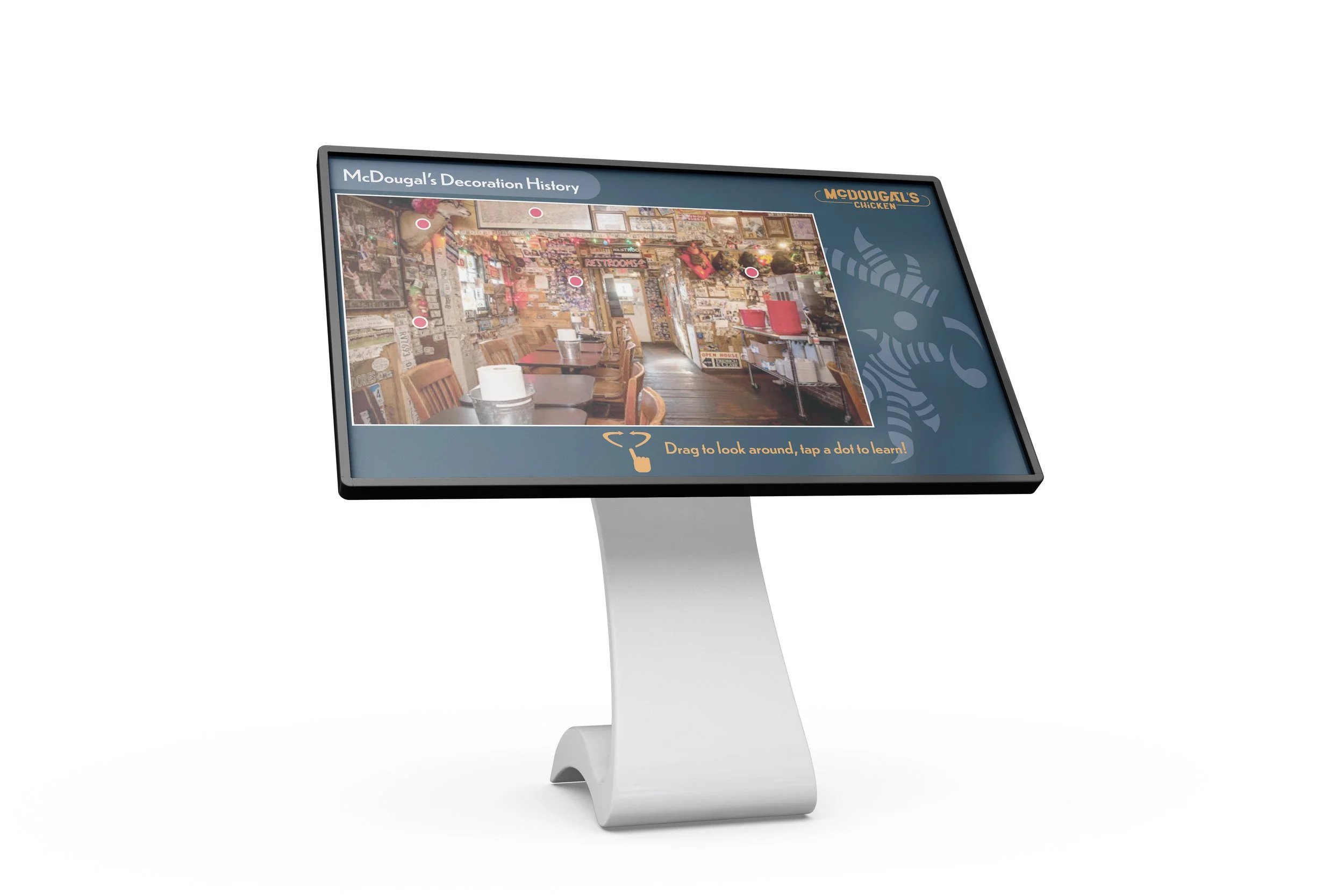
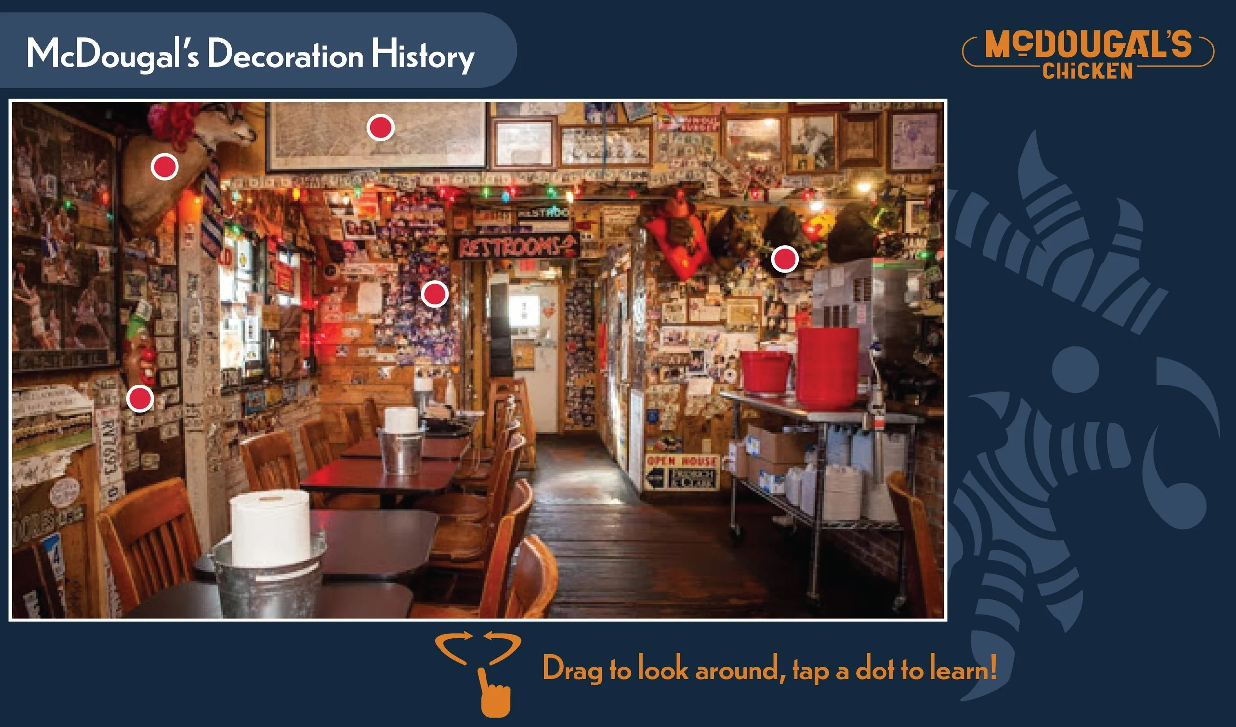
I began researching their history, what the differences between their locations were, and sketching hundreds of logos. The one you see to the left is the one I went with, although there is an alternate logo that can be found on the coaster. We were asked to make eight touchpoints with mockups that resonated with the new identity and provide an innovative touchpoint that would set the brand apart.


